ShopDreamUp AI ArtDreamUp


Suggested Deviants


Suggested Collections


You Might Like…


![[Skyline19 Repost] Why do you hate me?! (MLP:FiM)](https://images-wixmp-ed30a86b8c4ca887773594c2.wixmp.com/f/4251b8c3-67c7-4561-bfb7-a50d82fdf74e/desuu1z-abc3978a-b841-435c-83fb-a8702a44cf5a.png/v1/crop/w_184,h_184,x_0,y_2,scl_0.10716365754222,q_70,strp/_skyline19_repost__why_do_you_hate_me____mlp_fim__by_thereedster_desuu1z-92s-2x.jpg?token=eyJ0eXAiOiJKV1QiLCJhbGciOiJIUzI1NiJ9.eyJzdWIiOiJ1cm46YXBwOjdlMGQxODg5ODIyNjQzNzNhNWYwZDQxNWVhMGQyNmUwIiwiaXNzIjoidXJuOmFwcDo3ZTBkMTg4OTgyMjY0MzczYTVmMGQ0MTVlYTBkMjZlMCIsIm9iaiI6W1t7ImhlaWdodCI6Ijw9MTc3NCIsInBhdGgiOiJcL2ZcLzQyNTFiOGMzLTY3YzctNDU2MS1iZmI3LWE1MGQ4MmZkZjc0ZVwvZGVzdXUxei1hYmMzOTc4YS1iODQxLTQzNWMtODNmYi1hODcwMmE0NGNmNWEucG5nIiwid2lkdGgiOiI8PTE3MTcifV1dLCJhdWQiOlsidXJuOnNlcnZpY2U6aW1hZ2Uub3BlcmF0aW9ucyJdfQ.zvIJ0-LsXV8CLAL0hEEdJrX8-xwvo_byjN6vGeh0qsg)
![[Skyline19 Repost] Why do you hate me?! (MLP:FiM)](https://images-wixmp-ed30a86b8c4ca887773594c2.wixmp.com/f/4251b8c3-67c7-4561-bfb7-a50d82fdf74e/desuu1z-abc3978a-b841-435c-83fb-a8702a44cf5a.png/v1/crop/w_92,h_92,x_0,y_1,scl_0.053581828771112,q_70,strp/_skyline19_repost__why_do_you_hate_me____mlp_fim__by_thereedster_desuu1z-92s.jpg?token=eyJ0eXAiOiJKV1QiLCJhbGciOiJIUzI1NiJ9.eyJzdWIiOiJ1cm46YXBwOjdlMGQxODg5ODIyNjQzNzNhNWYwZDQxNWVhMGQyNmUwIiwiaXNzIjoidXJuOmFwcDo3ZTBkMTg4OTgyMjY0MzczYTVmMGQ0MTVlYTBkMjZlMCIsIm9iaiI6W1t7ImhlaWdodCI6Ijw9MTc3NCIsInBhdGgiOiJcL2ZcLzQyNTFiOGMzLTY3YzctNDU2MS1iZmI3LWE1MGQ4MmZkZjc0ZVwvZGVzdXUxei1hYmMzOTc4YS1iODQxLTQzNWMtODNmYi1hODcwMmE0NGNmNWEucG5nIiwid2lkdGgiOiI8PTE3MTcifV1dLCJhdWQiOlsidXJuOnNlcnZpY2U6aW1hZ2Uub3BlcmF0aW9ucyJdfQ.zvIJ0-LsXV8CLAL0hEEdJrX8-xwvo_byjN6vGeh0qsg)


Description
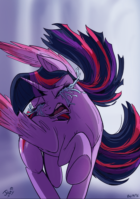
once again Jowy is playing around with the emotions of colourful Equines and maybe the emotions of the watchers.
I did try my best to make this expression look genuine in the eyes and movement of Twi's body as she begins to turn around.
drawing sadness can be fun in an odd way
Note : OK I will admit the tears are a bit of an overkill My aim was to sort of show them in motion as if they are following her body movement but I can see how the thickness of them dose look a lot less real. certainly will take that in consideration when I try crying again in the near future, possibly even sooner (Smile)")
Until next deviation LATERS Bronies
drawn and coloured in Photoshop CS6 with my Wacom pro in 4 hours
Epic FTW or Do Not want
  you choose :mwahaha
I did try my best to make this expression look genuine in the eyes and movement of Twi's body as she begins to turn around.
drawing sadness can be fun in an odd way
Note : OK I will admit the tears are a bit of an overkill My aim was to sort of show them in motion as if they are following her body movement but I can see how the thickness of them dose look a lot less real. certainly will take that in consideration when I try crying again in the near future, possibly even sooner
Until next deviation LATERS Bronies
drawn and coloured in Photoshop CS6 with my Wacom pro in 4 hours
Epic FTW
Image size
583x827px 486.41 KB
© 2016 - 2024 JowyB
Comments33
Join the community to add your comment. Already a deviant? Log In
Overall, this piece is well done. However, after staring at it for a minute, if I had to use a single word to describe it, that word would be, "awkward", but not in a bad way. I use that word because of her pose as well as the "camera angle". From the viewer's point of view her body is curving to her right, yet the back legs appear straight back from our point of view; Her right front leg is in motion reaching out and to the right; and her left most wing is high and curving off to her right. Individually, these parts can make for an odd whole, however, when you take in consideration that she's RUNNING AWAY from somepony (you don't cry like that because someTHING upset you, no, definitely somePONY) those odd pieces add to her overall motion. So, for me, this piece feels like a frame from a film, where we can see her body in motion and can see how weird a physical body can actually move in the real world (reality does NOT move like comic strips or most animation - go examine a few frames from films of bodies in motion and you'll see what I mean). So, yes, 'awkward', because it's not a 'normal' view of a pony in mid-run. It's very 'in motion'. I like it!
Now, on to the usual stuff:
* Technique - the artist has good use their tools and a solid understanding of (imaginary pony) anatomy. Could use a little work on her right front hoof - the fact that the bottom of her hoof is just flat loses a bit. I'd recommend adding a frog or possibly a horse shoe just to help set off the bottom of the limb, otherwise, it can seem as an odd oval. But, the artist shows to me that they put a lot of work into this to make their vision a reality. BTW, I really did the mane and tail. Good job there.
* Vision - I'm giving high marks to this one - the artist had a clear idea in mind when they executed the piece. So it worked out well.
* Originality - OK, it's a crying book-horse, that's not all that unique or original. However, the angle and implied action of said crying book-horse is much more original for me.
* Impact - Somepony has upset our favorite book-horse, and that upsets me. So... good job? (yes, there was a definite impact. <img src="e.deviantart.net/emoticons/s/s…" width="15" height="15" alt="
There's one major flaw for me, however, and that are her tears: too much, too thick, too heavy. Looks like ugly cream or milk. The tears on her face are OK (but I would have used a shade of blue closer to her coat so they didn't appear to be so distinct, but that may have been intentional, dunno), but the tears flowing into air are unnecessary. At best, I would recommend a few drops off to either side, not a connected flow of liquid. Just dial it back here.
One last point, and I can't decide if it bothers me or not, her horn appears a little small and thin, but I'll mark that up to artist interpretation, but it looks like it's not in line with her face. To me, her face seems to be facing the viewer more than the point of her horn is, but I'm just not sure. Consider me confused on this point.